


Color is a critical part of our visual world influencing how we perceive, think, and feel about the spaces around us. Among countless color combinations, two hues often overlooked but powerfully captivating are yellow and purple. These complementary colors may seem like unlikely companions, but their union creates striking contrast, emotional depth, and endless design possibilities.
This blog dives into how the pairing of yellow and purple works, why they have such an enduring visual impact, their placement in design and branding, as well as tips for leveraging their unique harmony in your own projects.
If you’re ready to discover the magic behind these vibrant opposites, keep reading!
The Science Behind Complementary Colors

Before getting into design applications, it’s important to understand why yellow and purple are complementary colors. On the traditional color wheel, complementary colors are positioned directly opposite one another. This opposition creates high contrast and draws attention to both colors when placed together.
- Yellow, as one of the primary colors, represents brightness, warmth, and energy.
- Purple, a secondary color formed by mixing blue and red, embodies mystery, depth, and royalty.
Together, they achieve a balance between light and dark, offering viewers a harmonious yet dynamic experience.
Why Yellow and Purple Work

Yellow and purple might seem too bold or intense when visualized separately. However, their differences are exactly what make them so captivating when paired correctly. Below are key reasons why this color duo works.
1. Vibrant Contrast
Yellow is the brightest hue in the spectrum, while purple is far darker and richer. Because their differences are so sharp, they create visual excitement and energy when used together. Their contrast can highlight important areas in designs, making them hard to miss.
2. Emotional Depth
Colors have psychological associations. Yellow evokes happiness, optimism, and friendliness. On the other hand, purple has ties to luxury, creativity, and nostalgia. The combination balances lighthearted cheer from yellow with the sophistication and intrigue of purple.
3. Color Psychology and Cultural Significance
Many cultures and industries have used yellow and purple in symbolic ways. For instance, purple is linked to nobility and spirituality across different histories, while yellow is seen as the color of sunshine and enlightenment. Together, they communicate a sense of positivity with a touch of regality.
4. Natural Pairing in Everyday Life
This combination isn’t just theoretical. You can see yellow and purple coexisting masterfully in nature! Think about the delicate contrast of yellow centers against purple petals in some flowers, like violets, lavender, or irises. Nature exemplifies how beautifully complementary colors work seamlessly.
Harnessing Yellow and Purple in Design

The vibrancy of yellow and purple makes them adaptable across fashion, advertising, graphic design, and beyond. Here’s how they can be applied effectively.
Graphic Design and Branding
Logo Creation
Brands aiming to leave strong visual impressions often take risks with their designs. Incorporating yellow and purple in branding can allow a brand to project youthfulness, creativity, or innovation with ease. For instance, sports teams are particularly fond of these colors (e.g., the LA Lakers).
Website Contrast
When designing digital assets or websites, pairing bright yellow buttons against a dark purple background ensures excellent readability while drawing immediate attention to calls to action. This makes it perfect for improving user engagement and navigation.
Packaging
Bold and innovative brands can use yellow to draw attention on packaging designs while adding purple to convey a premium feel. This works especially well for food and beverage brands or beauty products where sensory experience dominates purchasing decisions.
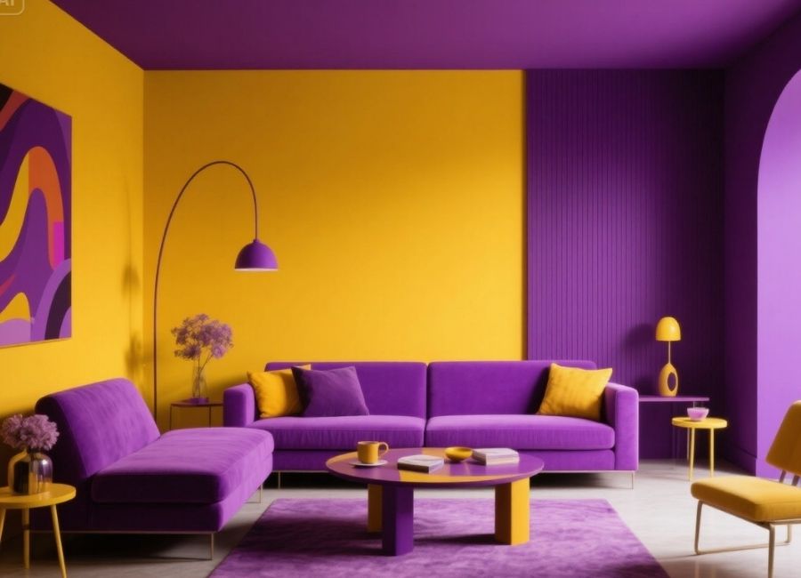
Interior Design
Yellow and purple elements in interior spaces might sound overwhelming, but when used sparingly or layered with neutral tones, their pairing delivers charm and creativity.
- Purple walls with yellow accents (e.g., pillows, vases) can enliven a living room.
- Kitchens fare well with a yellow backsplash and purple appliances for energetic, yet elegant looks.
By playing with different shades like pastels or muted hues instead of highly saturated tones, this combo feels less intimidating yet retains its contrast.
Fashion
Yellow and purple are fiery rivals on the color wheel—but best friends on the runway. Designers often pair mustard yellows with soft lilacs or bold, sunny yellows with deep royal purples to craft flashy but sophisticated looks.
You can use their striking contrasts as statement pieces. For instance, a purple dress paired with yellow accessories works as a subtle nod to the color wheel, while a bright yellow coat with a muted purple scarf makes for fashion-forward winter wear.
Events and Seasonal Themes
If you’re hosting a themed party, wedding, or seasonal event, consider yellow and purple! This pairing works wonderfully for springtime celebrations (e.g., Easter) where cheerful yellows embody reawakening while purples display elegance.
Tips for Using Yellow and Purple Together Seamlessly
Though bold, these colors can be refined into your designs without overwhelming your audience or aesthetic.
1. Play With Shades and Tones
Opt for pastels (e.g., lavender and pale yellow) for a soft, inviting touch or use deeper shades (like royal purple and mustard yellow) for a more striking and dramatic feel.
2. Balance is Key
Avoid making both colors overly dominant. Use one as the main focus and the other as an accent. For instance, a predominantly purple ad featuring yellow highlights will retain sophistication while keeping attention on key details.
3. Break it Up With Neutrals
Adding neutral tones like black, white, gray, or beige can diffuse their intensity. This is especially helpful in interiors or formal branding where yellow and purple might initially feel too strong.
4. Mimic Nature’s Balance
Taking inspiration from yellow-centered purple flowers can guide designs. Use proportions similar to nature’s ratios for an effortlessly harmonious aesthetic.
Final Thoughts Take Your Creativity to the Next Level
Yellow and purple may come from opposite worlds on the color wheel, but together they create visual magic that captivates, inspires, and communicates. Whether you’re a graphic designer seeking to add versatility to your projects, a decorator transforming spaces, or a brand building vibrant connections, this complementary pair offers endless opportunities.
Now that you understand the psychology, contrast, and application of these bold colors, why not start experimenting today? Add pops of yellow and purple to your branding, fashion, interior designs, or creative projects and make a lasting impression.