


When it comes to formatting, spacing plays a critical role in creating clean, professional, and readable documents. Regardless of whether you’re writing an academic paper, putting together a business proposal, or designing a website, knowing how much space to leave is essential to maintain a polished appearance and improve readability. Yet, this seemingly simple aspect of formatting often raises questions.
This blog post aims to answer one of the most common design and writing questions: How many inches of spaces should you leave, depending on the type of content? We’ll break down guidelines for margins, line spacing, and paragraph spacing, so you’ll be confident your content looks sharp and professional across mediums.
Why Proper Spacing Matters

Before jumping into the “how,” let’s talk about “why.” Proper spacing:
- Enhances Readability: Adequate white space around text makes it easier for the reader’s eye to follow content and reduces strain.
- Creates Visual Balance: Proper spacing adds structure and appeal, preventing pages from looking cluttered or overwhelming.
- Reflects Professionalism: For resumes, reports, and client deliverables, well-spaced text is a small detail that makes a lasting impression.
- Improves Accessibility: Spacing also contributes to making documents or websites accessible to individuals with visual impairments, as crowded layouts can pose challenges.
Now that we know the importance of spacing, let’s break down the different aspects of spacing and practical guidance on how many inches you need to leave for various contexts.
Margins
Margins are the blank spaces around the edges of your page. Standard margin settings ensure your content doesn’t look crammed or too spread out. Here’s a breakdown of recommended margins by use case.
Academic Papers and Reports
For essays, research papers, or other academic documents:
- Use 1-inch margins on all sides as per APA, MLA, and Chicago formatting guidelines.
- These consistent margins help achieve balance and meet academic standards for submission.
Business Documents
For business letters, proposals, and reports:
- Stick with the 1-inch margin rule on all sides.
- If you need to conserve space while still maintaining balance, reduce margins slightly to 0.75 inches, but do not go below this.
Artistic or Creative Layouts
If you’re designing a creative piece like a flyer or presentation:
- Margins often depend on the document’s size and aesthetics, but a 0.5-inch margin is common for layouts with extensive design elements while leaving enough room to avoid “edge cutting.”
Web Page Design
Unlike printed documents, websites work with percentages or pixels instead of inches, but the same principle applies. Leave enough space between borders and website content to avoid a cramped look. A minimum of 10-20 pixels of margin is advised for body text.
Line Spacing
Line spacing (vertical space between lines of text) impacts a document’s readability and visual hierarchy. Creating adequate separation between lines prevents text from appearing too dense.
General Guidelines for Line Spacing
- Single Spacing (1.0): Suitable for tightly packed content, like resumes or letters that must fit on a single page.
- 1.15 or 1.5 Spacing (Recommended Default): Best for most professional and academic documents. This spacing is generous enough to enhance readability without wasting space.
- Double Spacing (2.0): Common in academic writing (like MLA and APA papers), double spacing leaves plenty of space for teacher feedback or editing notations.
How to Choose the Right Line Spacing
Line spacing varies based on context:
- Formal Reports: 1.15 or 1.5 for polished readability.
- Resumes: Single spacing works well for saving page real estate while maintaining clarity.
- Manuscripts or User Manuals: Double spacing is preferred for easy annotation during editing stages.
Paragraph Spacing
Spacing between paragraphs prevents wall-to-wall text, making documents less intimidating and more digestible.
General Rules for Paragraph Spacing
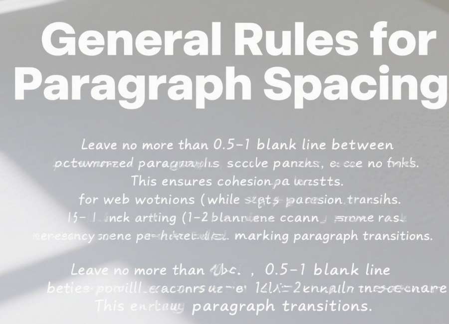
- For business documents or academic essays, leave no more than 0.5-1 blank line between paragraphs. This ensures cohesion, yet marks transitions between sections.
- For web writing (like blog posts or online articles), 1-2 blank lines between paragraphs improves readability, especially on different screen sizes.
- Newsletters or marketing emails frequently use 1.5 to 2 blank lines to give a sense of rhythm and draw attention to key phrases.
Tip: Configure paragraph spacing in text editors like Microsoft Word under the “Paragraph” settings to retain consistency.
Indents vs Blank Spaces for Paragraphs
Does every paragraph need an indentation or a blank line to separate it? This depends on the style guide or context:
- Academic Writing (APA, MLA): Typically, first lines of paragraphs are indented by 0.5 inches, with no extra blank lines between paragraphs.
- Web writing and business: Use blank lines between paragraphs rather than indenting for a cleaner, more modern look.
Special Considerations for Web and Mobile Content
On websites and mobile devices, spacing has a huge impact on user experience. Text that’s too dense can drive users away, while over-spaced content can look fragmented. Here are some tips:
- Line Height for Text: Aim for a line-height of 1.5 to 2 times the font size for body text on web pages.
- Padding: Provide generous padding (space within an element) for headers, images, or buttons. A minimum padding of 10px ensures elements don’t feel cramped.
- Break Up Text: For blogs, break dense paragraphs into smaller chunks (2-4 sentences max) with white space between.
Quick Cheat Sheet for Spacing in Different Contexts
- Margins: 1-inch standard for academic/business. Web elements follow pixel values (common range 10-20px).
- Line Spacing: Single (1.0) for resumes, double (2.0) for academia, 1.5 for reports.
- Paragraph Spacing: Blank line (1.15-2 spacing) for readability in documents/web writing.
- Indentation: Add 0.5 inches for each paragraph if no blank lines are used.
Professional Tip
When designing or writing, think about the ultimate purpose of your document. Is it to persuade, inform, or entertain? The right spacing choices will reflect the tone and enable readers to interact with your material more effectively.
Optimize Your Layout Today
Proper spacing can transform how your content is perceived. Whether you’re polishing a resume, finalizing an academic paper, or designing a compelling website, leaving the right amount of space helps put the focus on your message, rather than the formatting.
Want to take formatting to the next level? Explore advanced layout guides or consider using design tools like Adobe InDesign or Canva to ensure precision across all media.