


Have you ever wondered what happens when you mix red and green? While these colors might remind you of holiday decorations, mixing them in paint or ink gives a result you might not expect. Learning how red and green work together is a key part of color theory and can help you make better choices in art, design, and home decor.
This guide will show you what happens when you mix red and green. We’ll explain the color theory behind the result, look at the different shades you can make, and share tips for using this color mix in your own projects. By the end, you’ll know exactly what to expect when these two colors come together.
The Science of Mixing Red and Green
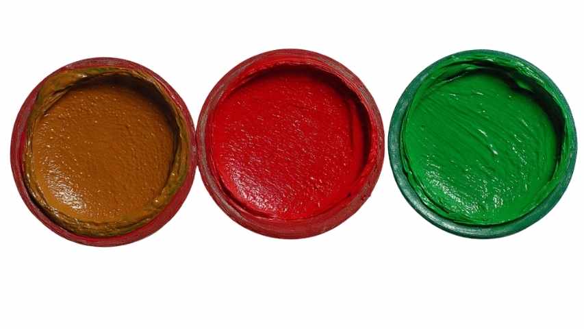
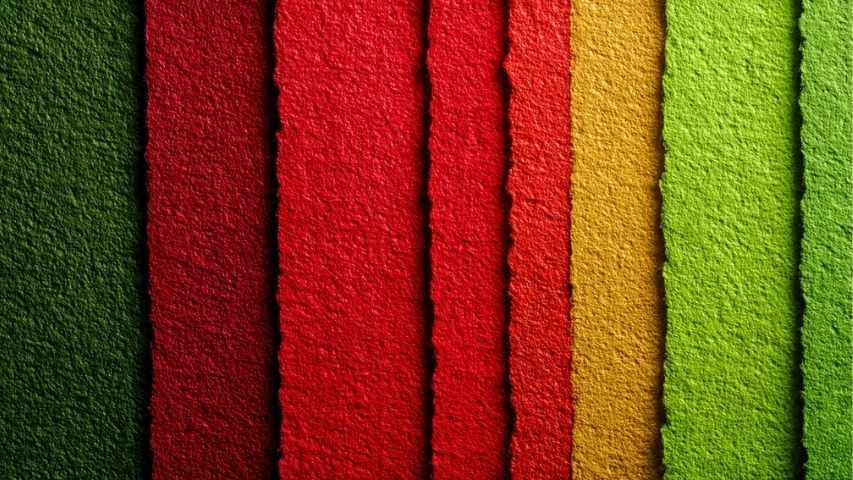
When you mix red and green paint, you get brown. This is because red and green are complementary colors. In the RYB (Red, Yellow, Blue) color model, used for mixing paints, complementary colors sit opposite each other on the color wheel. (RYB color model, 2025)
Here’s why they create brown:
- Green is a secondary color, created by mixing the primary colors blue and yellow.
- Red is a primary color.
When you combine red and green, you are essentially mixing all three primary colors: red, yellow, and blue. When all three primary colors are mixed, they absorb most of the light that hits them and reflect a dark, neutral color. (RYB color model, 2025) Depending on the exact shades and proportions of the red and green you use, this neutral color is typically a shade of brown. (RYB color model, 2025)
Creating a Spectrum of Earthy Tones
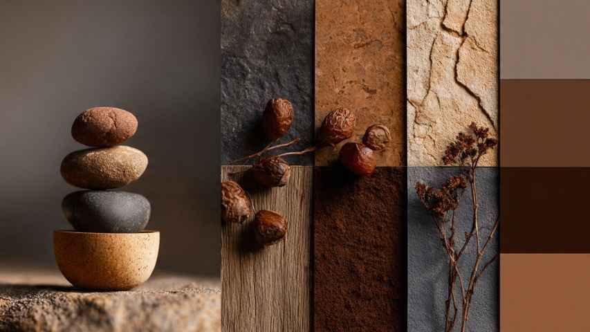
The answer “brown” is just the beginning. The specific shade of brown you create depends entirely on the ratio of red to green and the particular hues you start with. (Trebard Color Theory, 2012) By adjusting the amounts, you can produce a wide variety of earthy and muted tones.
More Red, Warmer Brown
If your mixture contains more red than green, you’ll create a warmer, reddish-brown. Think of colors like terra cotta, chestnut, or mahogany. These shades are rich and inviting, often used in art to depict natural materials like clay, brick, or autumn leaves. (RYB color model, 2025) A touch of extra red can bring a vibrant warmth to an otherwise neutral palette.
More Green, Cooler Tones
Conversely, adding more green to the mix will result in a cooler, darker brown with an olive or khaki undertone. These shades can resemble colors found in nature, such as mossy earth, deep forest shadows, or murky water. (Van Dyke brown, n.d.) These cool browns are excellent for creating depth and a sense of calm in a composition. For example, mixing a bright, emerald green with a deep crimson red might result in a deep, earthy brown perfect for landscape painting.
Can Red and Green Make Black?
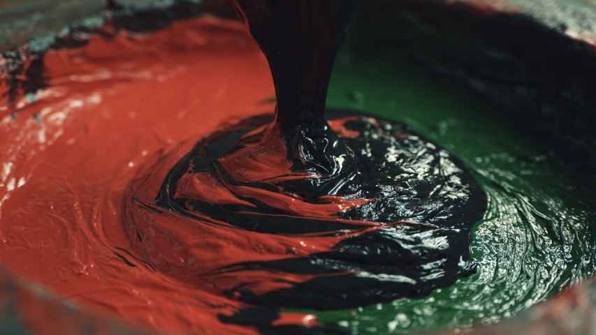
Yes, if you mix red and green in just the right way, you can get black or something very close. Because they are complementary, they can cancel each other out. When you mix equal amounts of pure red and pure green, they absorb all light and make black. (C O L O R, n.d.)
In reality, getting a true black can be difficult. The type of paint you use matters. Usually, you’ll end up with a very dark brown or a gray instead of pure black. Still, many artists use this method to make blacks that have more depth than regular black paint from a tube.
Practical Applications in Art and Design

Knowing how red and green mix isn’t just interesting—it’s a useful skill for anyone who creates art or design.
Creating Natural Skin Tones
Artists often mix red and green to make realistic skin tones. They start with a light brown base from red and green, then add white, yellow, or more red to get different natural complexions. The green balances the red, so the skin doesn’t look too pink or orange. (RYB color model, 2025)
Muting Bright Colors
Have you ever found a color too bright? Adding a little of its complementary color can tone it down. For example, if your red is too strong, mix in a bit of green to make it less intense without making it muddy. This gives you more control over your colors and helps you create more balanced artwork. (Sugita & Takahashi, 2018, pp. 1-8)
Shading and Shadows
Using complementary colors is a great way to make realistic shadows. Instead of adding black, which can look flat, try mixing in a bit of the opposite color. For example, to shade a red apple, add a little green to your red paint. This makes a darker, more natural shadow that still has color and life. (Painting Shadows With Complementary Colors, 2025)
A Foundation for Your Color Journey
Mixing red and green shows how flexible color theory can be. A simple question opens up a range of browns, earthy tones, and even black. By learning how these colors work together, you get a useful tool for your creative work. Whether you’re painting, designing, or just trying out colors, you can now make a wide palette from just red and green.
Next time you start a project, try mixing different amounts of red and green. Please take a look at what new colors you can create by experimenting with shades and ratios.