


Looking at a wall of paint chips can be overwhelming. You might go to the store for “white” paint, only to find hundreds of choices. Some whites look yellow, some look blue, and others look pink. What seemed like a simple decision quickly becomes one of the hardest parts of your home renovation.
Picking the right paint color matters because it changes a room more than any piece of furniture. Paint sets the mood, affects the lighting, and becomes the background for your daily life. Bright white can sometimes feel too harsh, but off-white is a more refined choice. It adds warmth, depth, and character without taking over the space.
The Benjamin Moore Off-White Color Collection is a top choice in interior design, offering over 150 shades of white (Off White Paint Color Collection by Benjamin Moore – Aboff’s Paints, n.d.). Each color has subtle differences that can make a room feel cozy, spacious, or modern. Whether you are painting one room or planning a whole house, learning how to choose from this collection is the first step to a polished result.
Why Off-White is the Designer’s Secret Weapon
Pure white is uncommon in nature and can feel harsh. Off-white, on the other hand, is naturally elegant and very flexible. It sits between a plain background and a purposeful color choice.
The magic of off-white lies in the undertones. These are the faint traces of other colors—yellow, gray, green, or pink—hidden within the white base. When you look at a paint chip in isolation, it might look white. But place OC-17 White Dove next to OC-37 Glacier White, and you will see a distinct difference. One feels soft and creamy, while the other feels crisp and cool.
Understanding these undertones is the key to preventing post-painting regret. If you have warm wood floors, a cool off-white might make your room feel disjointed. Conversely, if you have gray furniture, a creamy yellow-based white might look dingy rather than warm.
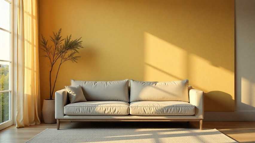
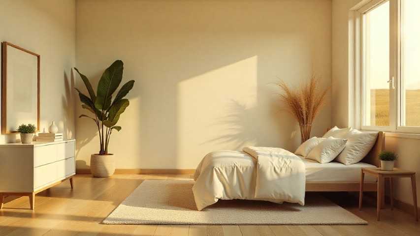
The Warm Off-Whites: Cozy and Inviting
Warm off-whites are like comfort food for your walls. They have yellow, orange, or red undertones that feel like sunlight. These colors work well in north-facing rooms with little natural light because they add warmth to the space (White Paint Colors | Benjamin Moore, n.d.).
OC-45 Swiss Coffee
This is a staple for a reason. Swiss Coffee is a creamy, soft white that removes the harshness of bright white without turning yellow. It is incredibly versatile and works well on trim, cabinetry, and walls. It pairs beautifully with natural wood stains, bringing a sense of history and ease to a room.
OC-17 White Dove
White Dove is one of the most well-known paint colors. It’s a soft, warm white with a touch of gray, so it doesn’t look too yellow. Many people use it for moldings and trim because it stands out against darker walls without looking too harsh.
OC-1 Natural Wicker
If you want a color with more depth, Natural Wicker is a very light beige. It brings steady warmth to a room, making it a great pick for living rooms or bedrooms where you want a relaxing atmosphere.
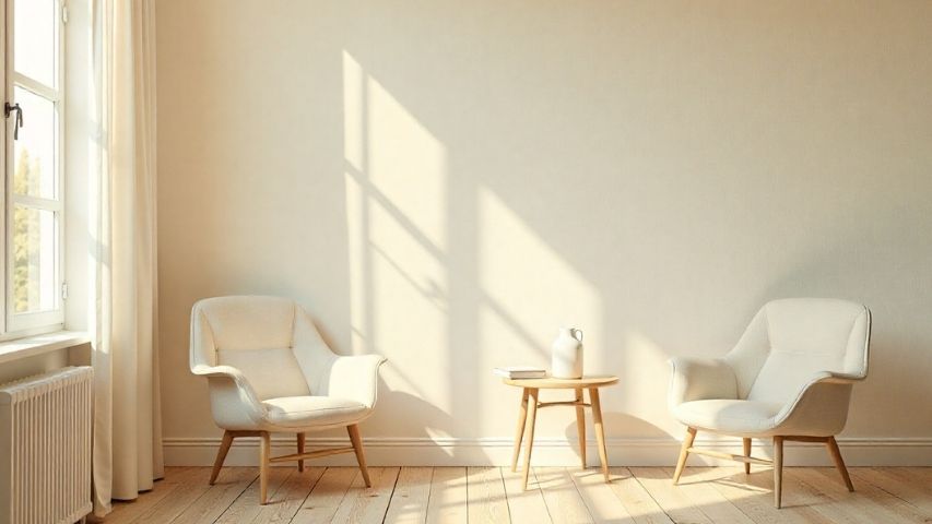
The Cool Off-Whites: Crisp and Modern
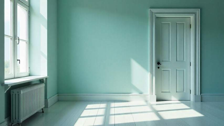
Cool off-whites have blue, green, or black undertones. They create a sense of spaciousness and calm. These shades work exceptionally well in south-facing rooms that get plenty of warm sunlight, as the cool paint helps balance the sun’s heat. They are also the go-to choice for modern, minimalist aesthetics. (Best Paint Colors for South-Facing Rooms, n.d.)
OC-37 Glacier White
Glacier White, as the name suggests, feels crisp and fresh. It’s a good choice for bathrooms or kitchens where you want a clean, bright look. It also goes well with marble counters and chrome fixtures.
OC-49 Titanium
Titanium is a unique color that’s between gray and white. It feels refined and a bit dramatic without being too dark. If you like an industrial style or want a neutral background for bold artwork, Titanium is a great option.
OC-26 Silver Satin
This shade offers a sleek, silvery appearance that reflects light beautifully. It is elegant and pairs well with cool tones like blues and purples. It is an excellent choice for a formal dining room or a sleek home office.
The “Greige” Middle Ground

Somewhere between warm and cool lies “greige”—the marriage of gray and beige. These neutrals are the chameleons of the Benjamin Moore collection. They adapt to their surroundings, picking up warmth from wood furniture or cooling down next to metal accents. (Best Greige Paint Colors According to Homeowners, n.d.)
OC-23 Classic Gray
Classic Gray, despite its name, often works as a refined off-white in different lighting. It’s light enough to brighten a space but has enough color to stand out against white trim. It’s a great choice to tie together open-concept homes (Classic Gray 1548, n.d.).
OC-20 Pale Oak
Pale Oak looks like white oak wood. It feels warm and natural, adding texture to your walls. Its earthy tone pairs well with natural fiber rugs and linen furniture.
OC-27 Balboa Mist
This is a slightly moodier greige. It has a depth that changes throughout the day. In the morning light, it might feel fresh and open; by candlelight, it becomes rich and enveloping.
Pairing Off-Whites with Other Elements
After you pick your wall color, think about the other features in the room. Off-white paint usually isn’t the main focus, but it helps everything else stand out.
Trim and Ceilings
You don’t have to use pure white for your trim. For a soft, layered look, try OC-14 Natural Cream on the walls and OC-13 Soft Chamois on the trim. This approach adds interest and gives your room a custom feel.
Wood Finishes
Wood floors and furniture have a big impact on how your paint color looks.
- For red or orange woods like cherry or mahogany, choose warm off-whites such as OC-12 Muslin or OC-3 Lambskin. Cool whites can make red-toned wood look old-fashioned.
- Blonde or ash woods are very flexible and match most colors, but they look especially stylish with crisp shades like OC-22 Calm or OC-30 Gray Mist.
- For dark woods like walnut or espresso, high contrast works well. A light, clean off-white such as OC-6 Feather Down stands out nicely against dark floors.
How to Test Your Paint Colors (The Right Way)
You can’t pick a paint color just by looking at a screen or a small paper sample. Light changes how colors look in every home. To be sure you’ll like the result, always test the color in your own space.
- Order Samples: Most retailers allow you to order color swatches or small sample pots.
- Paint Large Squares: Instead of a small stripe, paint a 2-foot by 2-foot square on at least two walls. Choose one wall with direct light and another in the shade.
- Wait 24 Hours: Check the color in the morning, at midday, and at night with your lights on. For example, OC-9 Ballet White might look great at breakfast but seem too pink by dinnertime.
- Compare: Put your paint samples next to your trim and floors. How the colors work together is just as important as the paint color alone.
Frequently Asked Questions
What is the most popular Benjamin Moore off-white?
While popularity shifts with trends, OC-17 White Dove and OC-45 Swiss Coffee remain top sellers year after year due to their versatility and ability to work in both traditional and modern homes. (Best Selling Benjamin Moore Paint Colors Revealed: 2025 Trends, 2025)
Can I use off-white on the exterior of my home?
Yes, off-white is a timeless option for exteriors. Shades like OC-45 Swiss Coffee or OC-10 White Sand look bright and inviting outside. Just remember, sunlight makes colors appear lighter, so off-white will look paler on your siding than inside your home.
How many coats of paint do I need for off-white?
If you’re painting over a dark color, you’ll probably need a primer and then two coats of good paint. If the old color is already light, two coats are usually enough to get the right look.
What is the difference between “White” and “Off-White”?
“White” generally refers to paint with little to no pigment added, resulting in a high Light Reflectance Value (LRV). “Off-white” has pigments added to lower the LRV slightly and introduce undertones (gray, yellow, pink, or blue), creating a softer appearance.
Start Your Transformation
Painting is one of the easiest and most affordable ways to change a room. Whether you like the warmth of OC-4 Brandy Cream or the cool look of OC-50 November Rain, the Benjamin Moore Off-White Collection has a color for you.
Don’t let all the choices stress you out. Think about the mood you want and the light in your space. Order some samples, try them on your walls, and trust your gut. The right shade is out there to help make your house feel like home.