


Color trends change quickly. Neon greens might show up at fashion weeks, and millennial pinks can take over Instagram. But after these trends fade, designers often go back to classic, reliable colors. Gray is a steady favorite in design, forming the base for many great works. Still, not every gray is the same.
Pewter is more than an old metal alloy. As a color, it stands out quietly and earns respect without being flashy. It sits between the coolness of silver and the warmth of taupe. Whether you are updating a website or painting a bedroom, knowing what makes this shade special can take your project to the next level.
This guide covers the history, meaning, and technical details of Pewter. You’ll learn how to use this strong, neutral color with confidence.
What Exactly is the Color Pewter?
Named after the metal alloy composed primarily of tin, Pewter is a distinct shade within the gray family. While often associated with the dark, tarnished mugs of history, the digital representation of Pewter brings a clean, neutral versatility to the table.
In the digital design space, the specific Hex code for Pewter is #E9EAEC.
Pewter is different from plain black or white because it has depth. Its look suggests weight and value. Unlike other metallic colors, Pewter does not have to be shiny (Pewter Veil · #D3D3D3 · Name · Color, n.d.) or sparkly. Instead, it feels durable and timeless.
Technical Specifications
Graphic designers and printers need accuracy. If you want to use this exact shade, here are the color codes for hex #E9EAEC:
- RGB: In the Red, Green, Blue color space used for digital screens, Pewter consists of 91.4% red, 91.8% green, and 92.5% blue.
- CMYK: For four-color printing processes, the values are 1% Cyan, 1% Magenta, 0% Yellow, and 7% Black.
- HSL: The color has a hue angle of 220 degrees, a saturation of 7.3%, and a lightness of 92%.
These numbers show that even though Pewter is known for being heavy, this digital version is actually quite light. It works well as a background color and won’t overpower text or other design features.
A History Forged in Metal
To understand the color, it’s helpful to know about the material. The word “pewter” has no clear origin, which adds some mystery to its story (PEWTER Definition & Meaning, 2025). Still, the material itself is well-known in history.
Archaeological digs in London have unearthed pewter dinnerware and kitchen utensils dating back to Roman times. This tells us that the material—and the color associated with it—has been a part of human history for at least the turn of the first millennium. (2,000-year-old Roman pewter hoard discovered in Suffolk, 2023)
Because the metal was used for everyday essential items like plates, cups, and cutlery, the color carries a subconscious association with utility and longevity. It isn’t a color of frivolous decoration; it is the color of tools that build civilizations and items that survive the ages. (Pewter, 2021)
The Psychology of Pewter: Serious and Grounded
Every color makes us feel something, and Pewter is no different. It keeps the neutral feel of gray but adds a strong sense of seriousness (Pewter | color meaning, hex code, palettes, images, 2025).
When a brand or a home desiWhen a brand or home designer picks Pewter, it sends a message of stability. Pewter feels solid in a way that lighter colors do not. It suggests that the company or object is established, trustworthy, and built to last (Pewter Color and Information, n.d.)., Pewter is an excellent choice for:
- Professional Services: Law firms, banks, and architectural agencies often use this shade to communicate reliability.
- Minimalist Interiors: Pewter helps create a calm, simple space that makes it easier to focus and relax.
- Luxury Packaging: Pewter suggests high quality but is less bold than gold or black.
Mastering Pewter Color Combinations
One of the greatest strengths of Pewter is its neutrality. As a gray tone, it plays well with almost every color in the spectrum. However, because it carries that inherent “seriousness,” you need to be intentional about how you pair it to avoid a design that feels flat or depressing.
The Balancing Act
The key to using Pewter well is to balance its depth. Experts recommend pairing it with lighter colors for the best results (Pewter – Meaning, n.d.).
- Creams: Mixing Pewter with warm cream colors gives a soft, elegant contrast. The cream’s warmth balances the cool gray, making this combo great for living rooms or wedding invites (10 Colors That Go With Pewter, 2023).
- Light Grays: Using Pewter with lighter grays gives a modern, stylish look. This tone-on-tone method adds depth while keeping the color scheme simple (This is a ‘go-to neutral when a space needs softness’ – why designers love using Benjamin Moore’s best seller Light Pewter, 2025).
Related Shades
If Pewter isn’t quite hitting the mark for your specific project, you might want to explore its close relatives:
- Gunmetal Gray: This shade is darker and bolder than Pewter, and is often used for more industrial or edgy designs.
- Standard Gray: Pure gray usually doesn’t have the blue or cool tones that some pewter shades do.
Practical Applications in Design
How do you apply these codes and theories to real-world projects? Here are a few actionable ideas.
Web Design and UI
With a lightness of 92%, the #E9EAEC Hex code works well for website backgrounds. It’s easier on the eyes than pure white (#FFFFFF) and still lets black text stand out. It also gives your site a premium look.
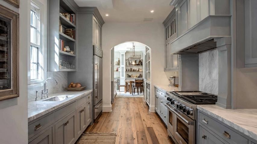
Interior Decor
Pewter is very versatile at home. In the kitchen, pewter hardware gives a softer, vintage look compared to brushed nickel. On walls, it acts as a neutral background that makes art and furniture stand out. Since it’s neutral, you can easily update accent colors like pillows or rugs without repainting.
Fashion and Apparel
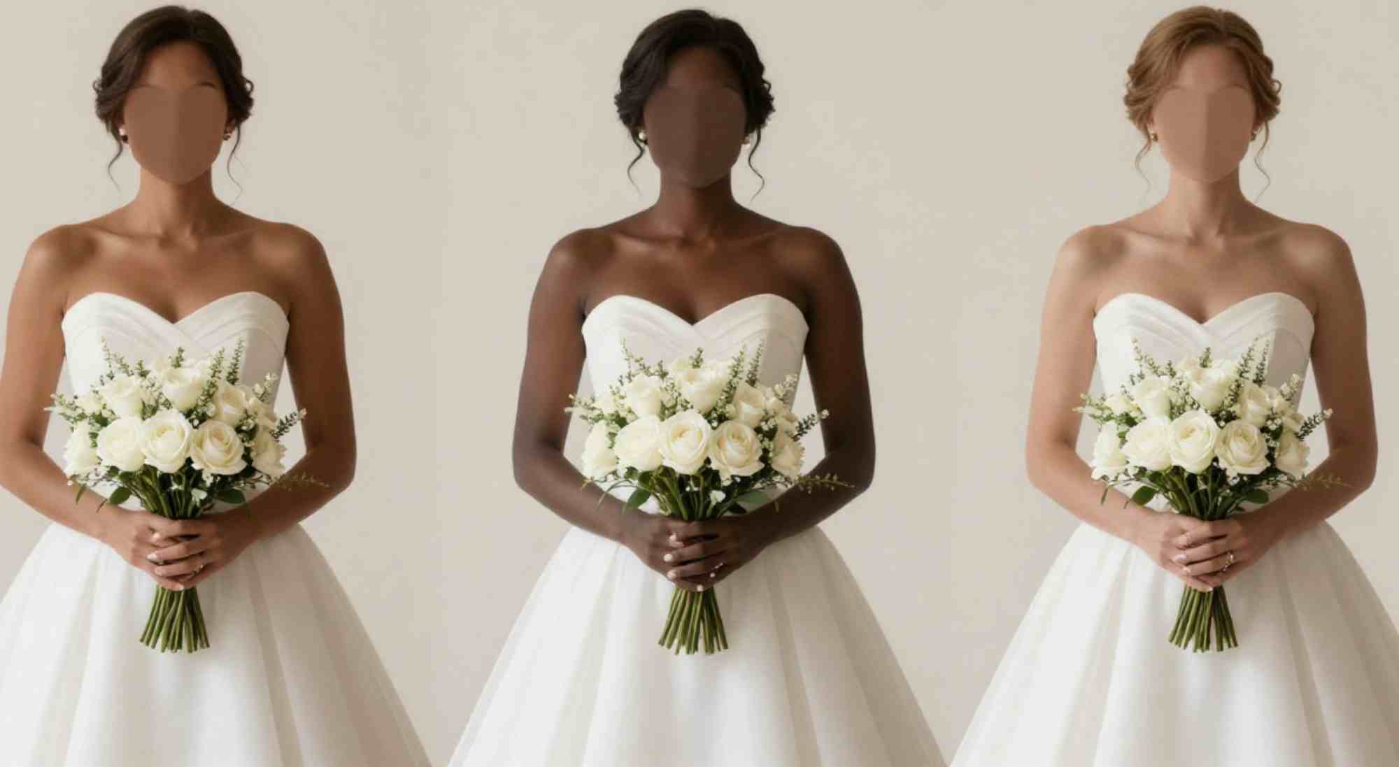
In clothing, Pewter is often viewed as a practical neutral. It is less harsh than black, making it suitable for a broader range of skin tones. A pewter blazer or scarf adds a touch of professionalism to an outfit without appearing too severe.
Designing with Timelessness
Pewter stands for endurance. From ancient Roman tools to today’s web design, it has lasted because it’s versatile and quietly strong. It doesn’t demand attention, but you always notice it.
If you want your brand to feel trustworthy or your living room to feel like a sanctuary, Pewter is a great choice. It lets other features stand out while giving your design a strong, elegant base.