


Choosing the right color palette can be challenging, especially when you’re working with subtle, neutral tones like linen and taupe. Both colors are versatile and popular in fashion, interior design, and home décor, but they often get confused due to their understated and somewhat similar appearances. This guide will help you understand the differences between linen and taupe, their unique characteristics, and how to choose which one works best for your needs.
What is linen?
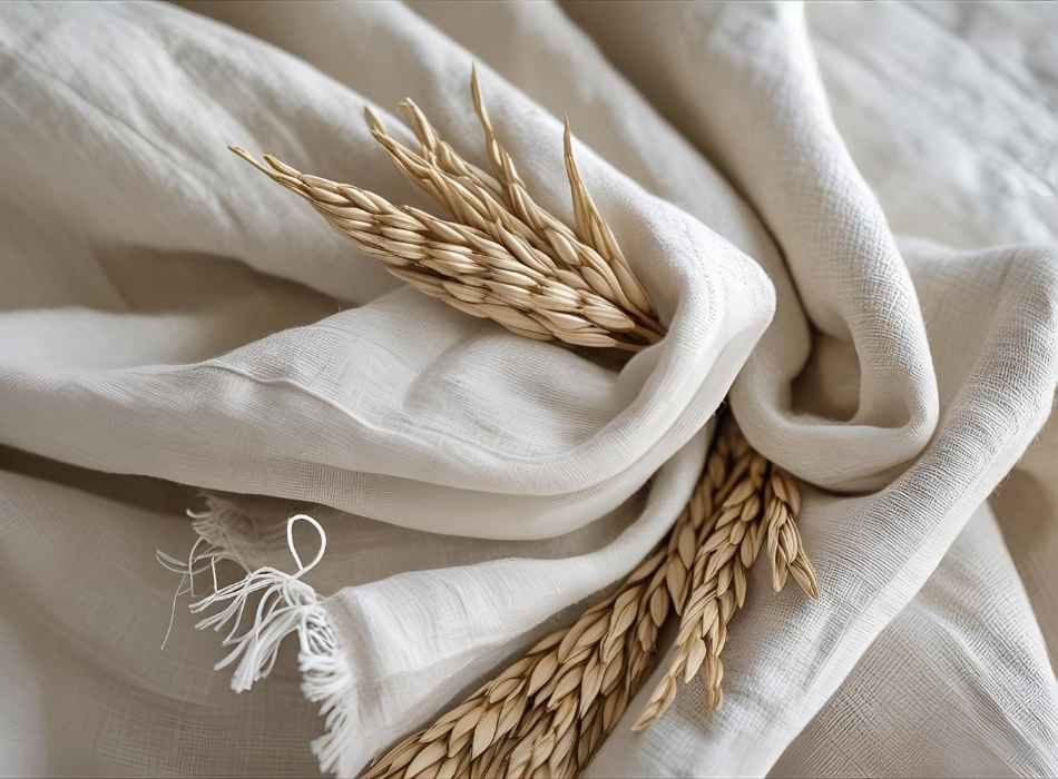
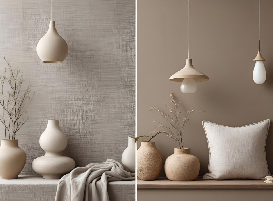
Linen is a light, neutral color that draws its inspiration from the natural fibers of the flax plant, which is commonly used to produce linen fabric. The color linen is soft and airy, with a slight off-white or beige hue. It embodies a sense of warmth and brightness, making it a perfect choice for creating a clean, minimalist aesthetic in spaces or outfits.
Key characteristics of linen
- Tone: Linen is a pale, muted shade that typically leans towards beige or cream.
- Feel: Often described as crisp and refreshing, linen exudes an effortless elegance.
- Versatility: Linen complements both warm and cool color palettes, making it highly adaptable for various designs and styles.
When you think of linen, imagine the subdued color of undyed natural fabrics. It provides a neutral base that works beautifully in a variety of settings, from modern minimalist homes to classic formalwear.
What is taupe?
Taupe, on the other hand, sits somewhere between brown and gray, with undertones that can vary from warm to cool. The word “taupe” originates from the French word for mole, referring to the earthy, muted shades of the animal’s fur. Taupe is darker and more complex compared to linen, offering a grounding effect that adds depth and richness to designs.
Key characteristics of taupe
- Tone: Taupe is a blend of brown and gray, with variations that range from light to deep and smoky.
- Feel: It conveys a sense of sophistication and stability, making it ideal for creating cozy or luxurious atmospheres.
- Versatility: Much like linen, taupe pairs well with a range of colors but tends to lean more towards traditional and earthy palettes.
Taupe is frequently used in high-end interiors and fashion due to its timeless, understated appeal. It’s an excellent choice when you want to add a touch of elegance or sophistication without overpowering other elements.
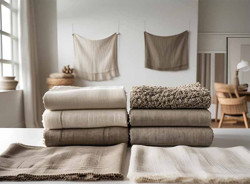
Linen versus taupe side by side
Exploring the similarities and differences between linen and taupe can help clarify their unique roles in design. Here’s a side-by-side comparison:
| Aspect | Linen | Taupe |
| Color family | Light beige/cream | Brown-gray blend |
| Tone | Pale, warm, airy | Muted, earthy, sophisticated |
| Brightness | Brighter, lighter | Darker, richer |
| Mood | Minimalist, clean, refreshing | Stable, cozy, elegant |
| Versatility | Pairs with both warm and cool tones | Best with earthy or neutral tones |
Now that we’ve outlined the key differences, you may wonder, “Which color is right for me?”
When to choose linen
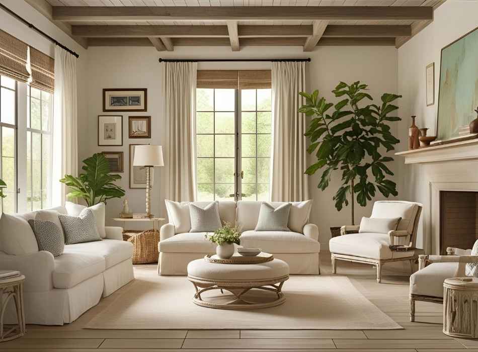
Linen is an excellent choice for projects or spaces where you want to create a light and airy feeling. Its subtle warmth works beautifully in:
- Minimalist décor: Linen walls, curtains, or furniture help create a clean, serene environment.
- Summer fashion: Light linen hues mimic the softness of sunny days, perfect for casual clothes or beach outfits.
- Modern spaces: It pairs well with sleek designs and metallic accents for contemporary looks.
If you’re someone who prefers bright, neutral tones and aims to keep things understated yet refined, linen might be your best bet.
When to choose taupe
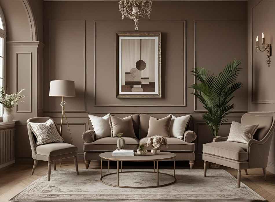
Taupe is perfect if you’re looking to achieve a more grounded, cozy, or opulent vibe. Consider taupe for:
- Cozy interiors: Taupe walls or upholstery create warm, inviting spaces, ideal for living rooms or bedrooms.
- Sophisticated fashion: Taupe suits, coats, or accessories add depth and elegance to formal or casual wardrobes.
- Layered designs: Its complexity makes it a fantastic base color to mix with patterns, textures, or bolder colors.
Opt for taupe if you want a richer, earthy tone that brings warmth and timeless sophistication to your designs.
Pairing linen and taupe together
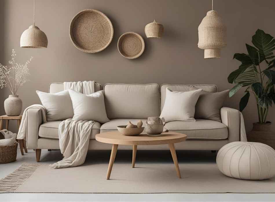
One of the best things about these two colors is how well they complement each other. Linen’s lightness and taupe’s depth create a harmonious balance, making them a popular combination in many settings:
- Layered bedding: A taupe duvet with linen-colored sheets gives a bedroom a chic yet cozy look.
- Neutral outfits: Pair a linen top with taupe trousers or accessories for a polished, monochromatic ensemble.
- Balanced interior design: Use taupe for furniture and rugs, while incorporating linen as a wall color or accent for a balanced, unified look.
While both shades are neutral, the contrast between their brightness and depth can bring a sense of completeness to any design.
Tips for choosing between linen and taupe
When deciding between linen and taupe, consider the following factors:
- Lighting: Spaces with plenty of natural light work well with taupe since it absorbs and softens the intensity of light. Linen, on the other hand, can brighten dim rooms.
- Purpose: Think about the atmosphere you want to create. Linen is great for light, relaxed vibes, while taupe adds warmth and sophistication.
- Accent colors: Consider the color palette you’ll work with. Linen pairs well with pastel blue, soft pink, or sage green. Taupe works beautifully with deep greens, navy, or even metallics.
- Seasonal feel: Linen conveys a summery, open feel, while taupe brings in a cozy, fall or winter vibe.
Infuse your space with the perfect neutral
Whether you’re curating your wardrobe or designing your home, choosing between linen and taupe ultimately comes down to the environment you want to create. Both colors offer incredible versatility and timeless appeal, so you might even find yourself using both in different projects. With your newfound understanding of their differences, you’re better equipped to make confident, stylish decisions.
If this guide has helped you gain clarity on these two stunning neutral tones, stay tuned for more tips on mastering color design.