


Creating the perfect shade of purple might seem like magic to some, but it’s all about understanding color theory. Whether you’re an artist seeking to fine-tune your next masterpiece, a designer needing custom color palettes, or an enthusiastic art student, knowing how to mix colors is essential. Color is powerful outside the creative industries—it can influence mood, enhance communication, and ensure workplace safety through visual cues.
This blog delves into purple, explaining which colors work together to create this versatile hue and how you can tweak it to achieve the right tone and balance. You’ll learn about primary and secondary colors, their unique relationships, and how to avoid common mistakes when mixing colors.
By the end of this guide, you’ll know exactly what colors make purple and how to craft any variation of purple you need.
Understanding the Basics of Color Theory
Before discussing how to make purple, it’s essential to understand the basics of color theory. This knowledge forms the foundation for virtually every design and artistic decision you’ll make.
Primary Colors and Their Role
Primary colors are the most straightforward and fundamental building blocks of all other colors. These are:
- Red
- Yellow
- Blue
These colors cannot be created by mixing other shades, so they take center stage on the classic color wheel.
Secondary Colors
When you mix two primary colors, you get what is known as a secondary color. Mixing red and blue, for example, creates purple—a secondary color that plays a significant role in art, design, and psychology.
Here’s a quick breakdown of secondary colors:
- Blue + Red = Purple
- Yellow + Blue = Green
- Red + Yellow = Orange
Using this foundation, we can explore the nuances of purple’s creation.
What Colors Make Purple?
Purple is born when you blend red and blue. However, not all red and blue shades are created equal, and depending on the specific tones you use, the final color can vary dramatically. From vibrant violets to muted lavenders, here’s how to craft various shades of purple:
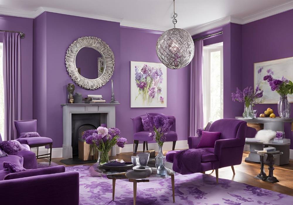
The Perfect Purple
To achieve a balanced, true purple, use primary red and primary blue in roughly equal parts. Mixing smaller amounts of either color may shift you toward related shades such as magenta (with more red) or blue-violet (with more blue).
Warm Tones vs. Cool Tones
Warm Purples
Want a purple with cozy, inviting vibes? Choose a warmer red, like crimson or cadmium red, and pair it with blue tones with hints of warmth, such as ultramarine. These combinations lean toward plum or wine-colored purples.
Cool Purples
Cool purples feel light and soft, often evoking calm or serenity. Use more fabulous reds, such as alizarin crimson or rose, and mix them with cool blues, such as cerulean or cobalt. These blends result in pastel-inspired shades like lavender or periwinkle.
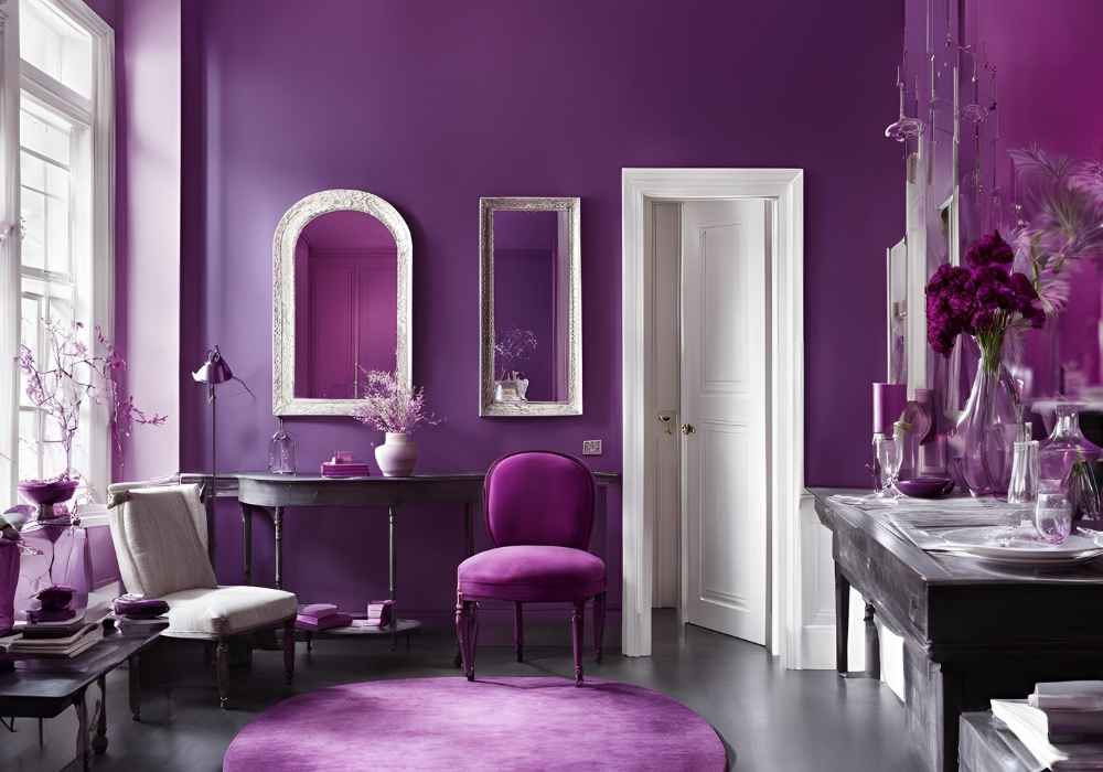
Adjusting Purple with Light or Dark Tones
Creating Dark Purples: Introduce increments of black to deepen purple into luxurious shades like royal purple or eggplant. Be cautious, as too much black can overwhelm purple’s vibrancy.
Softening Purple: Add white to create delicate tints such as lilac or mauve. These are ideal for softer designs or highlighting feminine tones in print and web design.
Why Does My Purple Look Muddy?
One common issue when mixing purple is ending up with a dull, muddy hue instead of a bright, sharp violet. This often happens when your red or blue paint contains yellow traces, interfering with color mixing. Stick to primary shades without undertones for the most vibrant results.
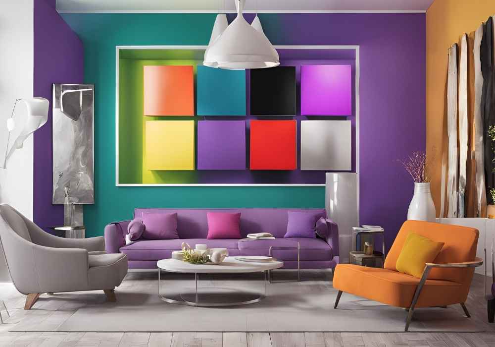
Purple Beyond Art and Design
The importance of purple isn’t limited to color theory alone. Its applications extend across multiple industries, from workplace safety to branding. Here are a few practical applications where understanding shades of purple can make all the difference:
Purple in Branding and Design
For brands, purple conveys prestige, mystery, and creativity. Think of renowned companies like Cadbury or Yahoo!—their strategic use of purple reflects refinement and innovation. Knowing how to mix subtle variants helps designers hit just the right emotional note.
Purple in Workplace Safety
While it’s a lesser-seen shade in this field, purple is often used to denote radiation hazards or specific safety instructions. For workplace safety managers, balancing the right tones ensures the displayed information is clear, noticeable, and effective without causing unnecessary strain to viewers.
Artists and Visualization
For artists, a perfectly mixed purple can symbolize spirituality and imagination by evoking historical luxury. Mastery over subtle shades allows paintings and illustrations to tell compelling stories and create emotional depth.
Common Mistakes (and How to Avoid Them)
Even experienced individuals make mistakes when mixing colors. Below are some pitfalls to watch out for:
Rushing the Process
Patience is key. Add colors a little at a time rather than pouring large amounts into the palette. This helps prevent overshooting the desired hue.
Neglecting Undertones
Always check the undertones in your red and blue before mixing. Reds with orange or yellow undertones and blues with greenish hints will produce less vibrant purples.
Using Poor Quality Supplies
Avoid cheap pigments or low-grade paint, as these often lack richness and purity. Investing in high-quality materials pays off in the long run.
Ignoring Context
The exact shade of purple might look different depending on the background or lighting. Experiment with its presentation to ensure consistency.
Achieving Your Purple Goals
From the deep, regal purples fit for a king’s robe to gentle lilacs straight out of nature, mastery over purple opens up limitless creative possibilities. Whether beautifying your latest creative project, designing for a brand, or setting visual cues for workplace safety, understanding the fundamentals of mixing colors is your first step.
Experimentation is part of the process, but armed with these tips, you can create unique, eye-catching shades that suit every purpose.
Your Next Steps:
Get hands-on with color mixing today! Practice blending your favorite reds and blues, jot down notes as you go, and experiment until you achieve the color combinations that feel just right. If you found this guide helpful, stick around our blog for more insights on color theory and design tips tailored to creative professionals!