


")
Green is one of the most versatile and widely used colors across industries—from art to design to safety management. But how much do you know about creating green? Whether you’re an artist mixing paint, a designer working with digital hues, or a workplace supervisor using green for safety signage, understanding how green is made can elevate your work.
This guide explores the science and artistry behind creating green, discusses its variations, and dives into its practical applications for professionals like you.
The Basics of Color Mixing
Green is a secondary color at its core, creating it by mixing two primary colors. For traditional color mixing in the realm of art and design, here’s how it works:
What Two Colors Make Green?
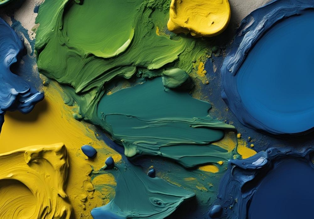
- Yellow + Blue = Green
This formula might seem simple, but the shade or tone of green depends significantly on the specific yellow and blue you use. For instance, a bright lemon yellow mixed with a cool cyan blue will produce a vibrant green, while mixing a muted ochre yellow with navy blue will result in a darker or more subdued green.
This fundamental principle of mixing yellow and blue applies when working with paints, crayons, or light.
Understanding Green in Light vs. Pigment
How colors are mixed can differ depending on whether you’re dealing with pigments or light.
Pigment-Based Color Models
For traditional artists using paint or ink (subtractive color mixing):
- Yellow and blue pigments absorb specific light wavelengths while reflecting others. Green emerges because the combination primarily reflects green light.
Digital and Light-Based Color Models
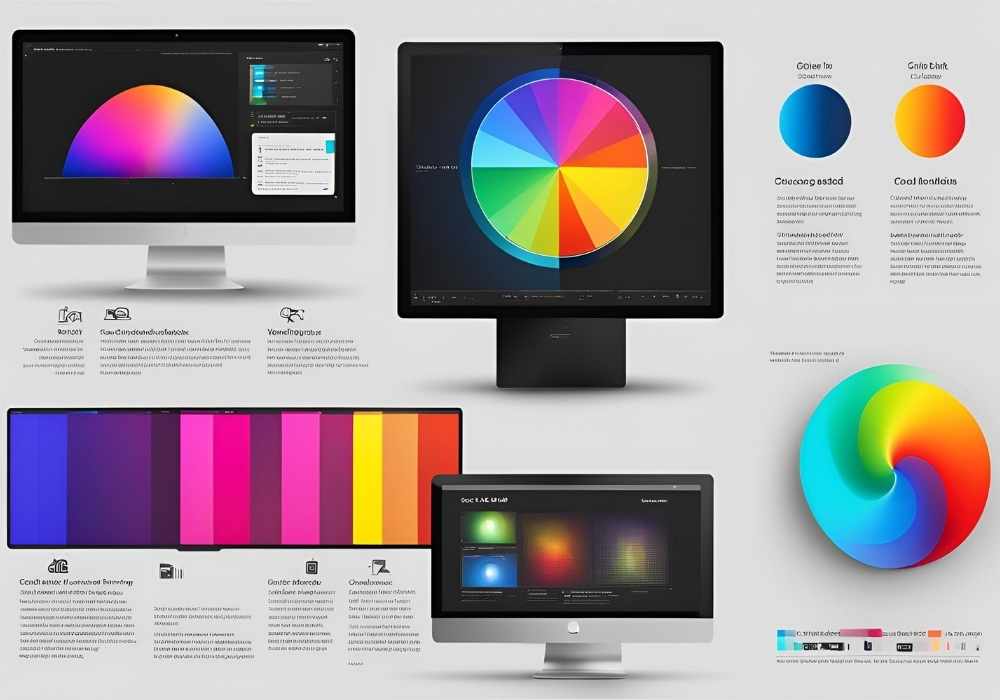
For designers working with screens (additive color mixing):
- Green is one of the three primary colors in the RGB model (red, green, blue). It is created when green light is emitted in isolation or in specific proportions with red and blue light (e.g., combining equal parts of red and green creates yellow).
Knowing the difference between these models is essential for design or digital graphics professionals.
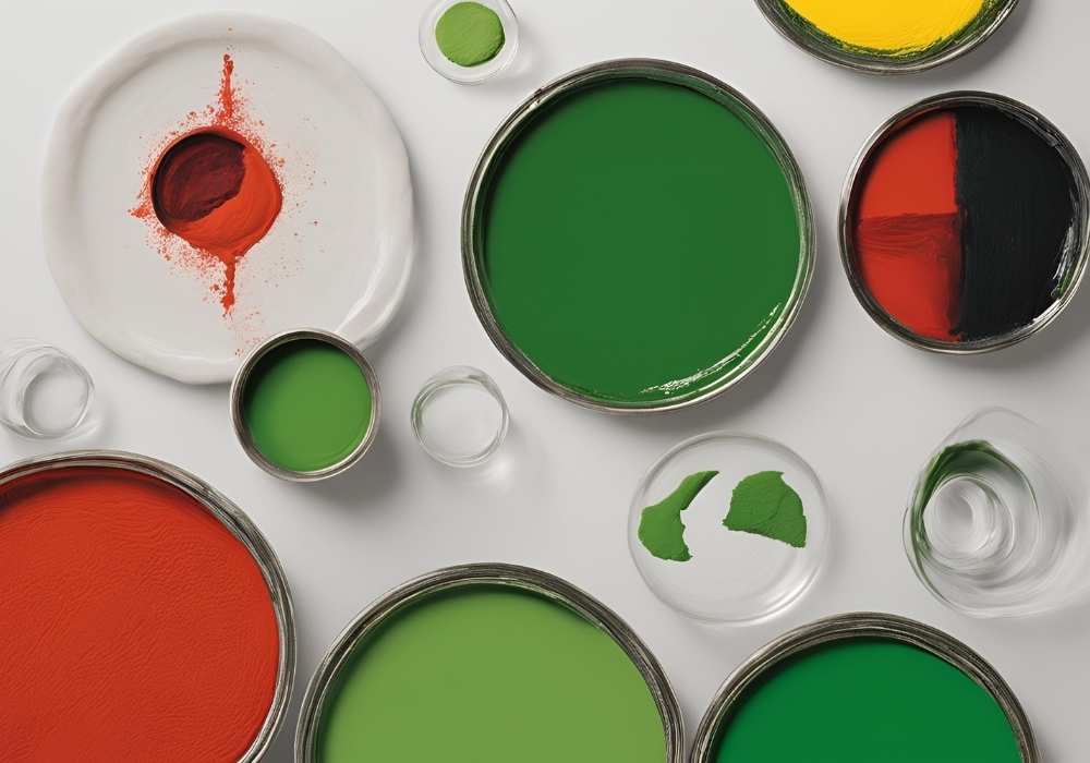
How to Create Different Shades of Green
The beauty of green is its adaptability. By tweaking the proportions of blue and yellow—or incorporating other colors entirely—you can create a variety of shades and tones of green.
Bright Greens
- Add more yellow to your mix.
A higher proportion of yellow creates cheerful, vibrant greens often linked to energy or youth. These are perfect for fresh spring palettes or children’s art!
Deep Greens
- Add more blue to your mix.
The more blue you introduce, the deeper or cooler your green will appear, making it ideal for logos, safety signage, or landscapes requiring rich shadows.
Muted Greens
Muted greens feel earthy and grounded, and they’re a favorite for classic designs and sustainability themes.
- Add a touch of red or complementary colors, slightly neutralizing the vibrancy.
Neon or Lime Green
Designers often seek neon greens for modern, futuristic projects.
- Add a bit of white or lean toward a green-yellow combo for electric results.
Sage or Olive Green
These greens are perfect for naturalistic or professional uses.
- Add a hint of gray or brown to soften the tones.
Experimenting with the balance of these colors will give you unlimited green variations to suit any purpose.
Applications of Green Across Industries
Green is much more than a color. Across various fields, it serves distinct purposes and evokes specific emotions.
1. Artists and Students
For painters and art students, green represents creativity and a connection to nature. It’s widely used in landscapes, abstract art, and figures representing harmony. Mastering how to create realistic greens is key for building depth in compositions.
Tip: To create realistic sunlight greens for trees, combine lime-green highlights with olive shadows.
2. Designers and Digital Creatives
For graphic and web designers, green is used strategically to convey freshness, growth, or eco-friendliness. Because screens utilize the RGB color model, understanding how to manipulate green in light—with codes like #00FF00 (pure green)—can make or break a color palette.
Tip: Contrasting green with complementary reds or oranges can enhance visual impact in any design layout.
3. Workplace Safety and Construction Supervisors
Green isn’t just an aesthetic choice; it signals safety and reassurance. Green is used on emergency exit signs, first-aid tools, and safe zones, and it attracts attention while conveying calm and reliability. Supervisors should understand which shades of green are clear and visible in various lighting conditions.
Tip: Bright greens are ideal for workplace signage as they ensure visibility even from a distance.
4. Product Designers
Think of brands selling health-conscious products—notice the use of green? Whether natural beauty products or organic foods, green communicates freshness and health. Shades of green can influence purchasing decisions by signaling eco-consciousness or sustainability.
Tip: Sage green and moss tones resonate well with eco-friendly brands, as they appear closer to natural earth tones.
Common Mistakes When Working with Green
Green may be versatile but prone to errors, mainly when used carelessly. Here are a few pitfalls:
1. Overcomplicating the Mix
Avoid mixing too many colors at once; this often leads to muddy or unattractive results. Instead, build up your green incrementally by adding a little of one secondary color at a time.
2. Ignoring Context
While lime green may work for athletic branding, it may be out of place in medical devices or formal settings. Always consider your audience and use Context to choose the right shade.
3. Skipping Contrast Testing
Green often blends into natural backdrops. For designs, ensure your green elements stand out by testing contrast. Complementary colors or neutral backdrops can help.
Pro Tips for Professionals
Mixing Greens for Paint:
- Always use a palette knife to ensure smooth blending.
- Test a swatch on canvas to confirm tonal accuracy under studio light.
Choosing Greens for Digital Design:
- Use tools like Adobe Colors to explore harmonious palettes featuring green.
- Reference industry-specific color codes for consistency.
Green for Signage:
- Prioritize brightness and clarity; safety should never be compromised.
- Test visibility under various conditions (daylight, low light, UV).
Mastering Green for Your Work
Green isn’t just a visually striking color—it’s a tool professionals can use to evoke emotions, enhance safety, and tell stories through art and design. Whether you’re a safety supervisor, artist, or designer, unlocking the potential of green expands your creative output and professional influence.
Are you ready to expand your expertise? Start experimenting with color mixing today, or explore interactive tools to refine your shade choices. And remember, with green, you’re not just working with color—you’re working with a connection to life and renewal.